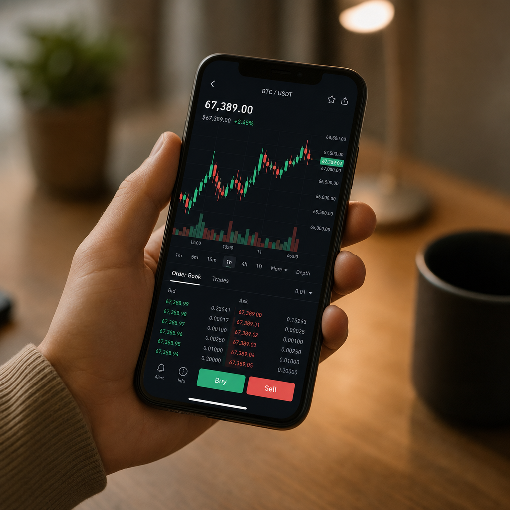
Open a crypto trading app for the first time and you'll get the same wall of information: jagged line graphs, blinking numbers, little candle-shaped bars stacked left to right across a chart, everything striped in two colours. One means up. One means down. You are apparently expected to know which is which.
Roughly one in twelve men in the UK has red-green colour blindness. For them, that entire visual system – the thing the whole interface is built on – collapses into a single muddy sameness. The "Bitcoin is surging" signal and the "Bitcoin is tanking" signal look identical. Which is a problem. But also, accidentally, a useful one. Because asking why the interface was built this colour way at all turns out to explain what it's actually trying to say.
Why were red and green chosen for markets at all?
Crypto didn't invent this. It borrowed the whole visual grammar wholesale from stock trading platforms, which borrowed it from commodity trading floors, which had their own physical, shouted, chaotic reasons for colour-coding things fast. On a trading floor in the 1980s you needed to know at a glance whether a price was above or below its opening level. Green for above (good, growing, go). Red for below (danger, falling, stop). The metaphors go back centuries – red ink in the ledger meant debt, green meant profit. Crypto just inherited all of that history and dropped it onto your phone screen, no explanation included.
What A Candlestick Is Saying
The candlestick chart – those rectangular bars that look a bit like a pub quiz graph drawn by someone with very steady hands – is the thing most new buyers ignore and probably shouldn't. Each bar represents one time period: an hour, a day, whatever you've set. The body of the bar shows the opening price and the closing price for that period, while the thin lines poking out of the top and bottom (called wicks, which is a genuinely lovely piece of terminology) show the highest and lowest price the asset hit during that same window.
So the bar isn't just "up" or "down". It's a small compressed story. It opened here, swung as high as this, dipped as low as that, and settled here by the end. Colour just tells you whether it closed higher or lower than it opened. Take the colour away entirely and the shape still contains all of that information – the wick lengths, the body position, the relative size compared to the bars around it.
For crypto specifically, wide wicks on both ends of a short body mean a lot of violent price movement that ended up roughly where it started. Traders have a word for this: indecision. Which, is a fair description of most of crypto's recent years.
The Numbers The Chart Is Built On
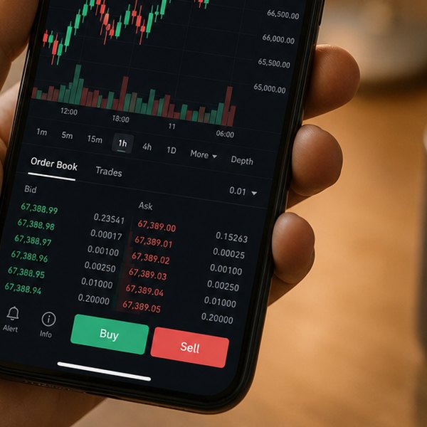
Below or beside most charts you'll find a volume bar – usually a quieter, smaller set of bars running along the bottom. Volume is the total amount of that asset that changed hands during each period. A big price move on low volume is considered less reliable than the same move on high volume, because fewer people were involved in making it happen. A price spike with no volume behind it tends not to stick around.
The percentage figure that usually sits next to the current price – "+4.2%" or "-7.8%" – is almost always a 24-hour change. Not from when you bought it. Not from its all-time high. Just from this time yesterday.
Can you change the colours in a trading app?
The reason all of this matters is that crypto platforms largely haven't updated their accessibility since the 2010s. Most still default to a red-green scheme with no alternative mode, which is a fairly strange choice given how many people are using them on a phone. Some newer platforms have begun offering high-contrast or colour-blind-friendly display settings; check the accessibility options before you assume the interface just looks that way for everyone.
But here's the genuinely useful thing about looking at these charts through the lens of "what if the colour meant nothing": you stop leaning on the colour and start reading the actual shape. The wicks. The volume. The time window you've selected. Those don't change with the palette. They're the information. The colour is just the highlight pen.
Questions this raises
- How do colour-blind traders read candlestick charts?
- Do UK accessibility rules apply to trading apps?