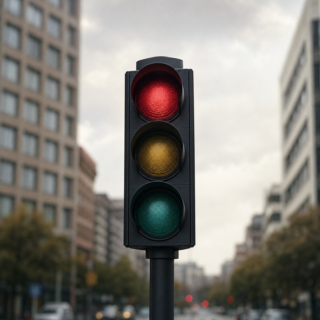
Open any stock market app right now and the first thing you see is a Christmas tree of numbers. Green ones climbing. Red ones falling. The whole thing twitches and pulses like a living thing, and in about a second and a half your eye has scanned the entire portfolio and told your brain whether today is a good day or a bad one. That speed is the point. The colour is doing work that the numbers alone, at a glance, simply cannot.
What the Colours Are Actually Encoding
Red and green on a market screen are not decoration. They are a compressed language. Green means the price is higher than it was at the start of the trading session; red means it's lower. That's genuinely it. But folded into that simple binary is an enormous assumption: that you can see the difference between the two.
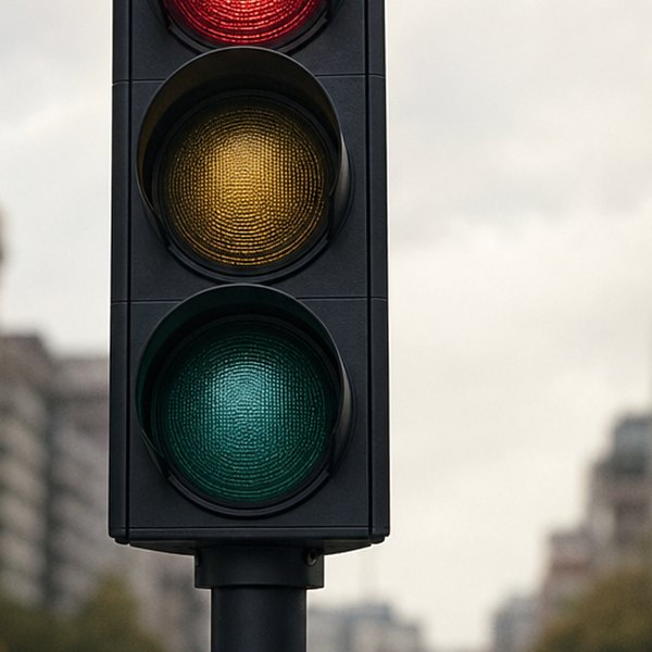
Roughly 8% of men in the UK have some form of red-green colour vision deficiency. Not full colour blindness, which is vanishingly rare, but the more common deuteranopia or protanopia – where the eye's ability to distinguish red from green is reduced to degrees of muddy brown and grey. For those people, a Bloomberg terminal or an investment app is not a dashboard. It's a fog.
Why do stock apps still use red and green together?
The red-and-green system wasn't handed down from on high. It drifted in from ticker tape culture, from the physical world of stock exchange floors where clerks used coloured chalk to mark prices up or down on chalkboards. Green for growth, red for danger – both deeply embedded in Western visual culture long before anyone was charting equities. By the time screens arrived, the shorthand was so baked in that nobody thought to question it. It simply became the default, and defaults tend to stay defaults because changing them inconveniences the majority.
Financial data platforms have been extraordinarily slow to respond. Some now offer alternative colour schemes – blue and yellow is one common substitute that most colour-blind users can read cleanly. But it's usually buried in accessibility settings, if it exists at all. Most apps don't mention it at the account creation stage. You have to know to look.
For more on how design assumptions quietly exclude people, see The Seam That Isn't There.
What the Market Assumes About You
This is where it gets interesting. Financial markets present themselves as pure information – numbers, percentages, ratios, the cold logic of price. But the way that information is packaged is full of assumptions about a particular kind of body reading it. Assumptions about sight. About the speed of a glance. About what "intuitive" means.
The red-green convention is just the most visible example. It tells you something about who the system was designed for and who was an afterthought. The data exists. Whether you can see it is a different question entirely, and for a surprisingly large number of people, the answer has always quietly been no.
Questions this raises
- How do colour blind investors read a market screen?
- Is there a way to change the colours in trading apps?
- Does red mean falling on every country's stock market?